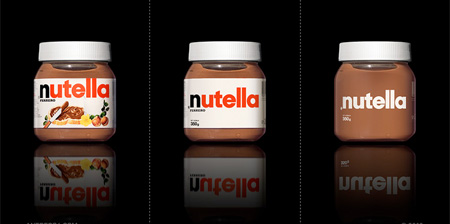
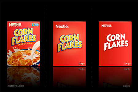
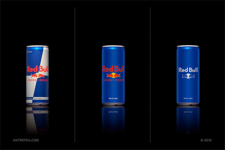
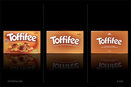
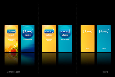
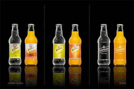
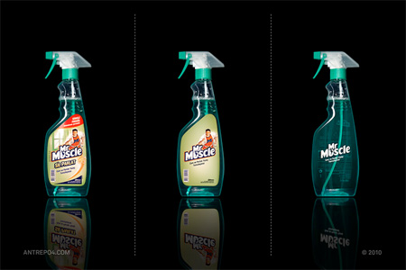
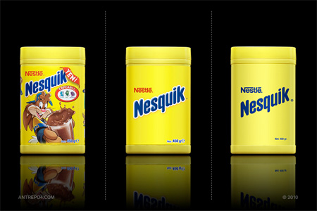
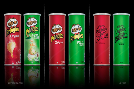
Series of clean packaging by Antrepo features simplified designs for Nutella, Pringles, Durex, Corn Flakes, Red Bull, and other popular brands.
“Minimalist effect in the maximalist market”
Also check out: Honest Logos and Simplified Logos

Series of clean packaging by Antrepo features simplified designs for Nutella, Pringles, Durex, Corn Flakes, Red Bull, and other popular brands.
“Minimalist effect in the maximalist market”


Also check out: Honest Logos and Simplified Logos
Mapache
Now days kids are growing in a minimal design world. We are all waiting for a second baroque period.
Dec 20th, 2010
Julie
Some of the food/drinks companies could use these to advertise low calorie/fat/salt foods.
Dec 20th, 2010
Zuli
simple is the best
Dec 20th, 2010
Renato Maq
Here in Brazil, some products are using a clean package too…
maybe a trend?
Dec 20th, 2010
morning_hen
I love all of them, except the Cornflakes n Nesquik… :D
Dec 20th, 2010
Tom
The Red Bull logo should still have a “red” bull in it, I think. Otherwise, very interesting concepts!
Dec 20th, 2010
kaoko
They actually use a very similar approach to packing multi-pack Pringles—the ones not labeled for individual resale. That aside, very interesting idea that can work with established brands.
Dec 20th, 2010
Iris
@Mapache I couldn’t have said it better.
Dec 20th, 2010
Danyboy
Really Interesting but in the reality of the market, it won’t perform, only design lover might buy it.
But the concept is interesting ! Might works for some vintage collection.
Dec 20th, 2010
sean
less is more
Dec 21st, 2010
DZRTJUL
I like it!
Dec 21st, 2010
psychodork
In most cases, I really like the inbetween on best.
Dec 21st, 2010
Gleasonator
I agree with psychodork, and was just about to write the same thing. The eye likes color, so I think it’s important to use it to keep the packaging more interesting. The Pringles are the best example of this. The leftmost image looks cluttered and trashy. The rightmost image looks cheap and like it was done simply as a method of being eco friendly or to cut costs. The center image has a very quality feel to it. It’s clean, but interesting. It’s just enough but not too much or too little.
Dec 21st, 2010
Zunny
it would be much more striking if we could see how these stack up in the field, crowded next to to other competitors.That is where you get the real effectiveness of any design, packaging is about creating the inducement to purchase otherwise it would all be minimal.
No one looks at a package in a black void except design students
and competition submissions.
Dec 21st, 2010
crzyninja
love it! makes the product looks clean professional and appealing, they’re all very known brands they dont need to rely on fancy graphics to promote their products
Dec 21st, 2010
Aidan
I think this is really really good, You never really notice how unnecessary all the decorations on the package are until you see this….. I really want that blue and silver Red Bull.
Dec 21st, 2010
Glenn Contreras
Redbull’s is the best!
Dec 21st, 2010
Maria
I like the nutella…and Pringles.
Dec 21st, 2010
Doink
This is a very good marketing strategy when your brand is really popular. A minimal design gets your logo noticed alot easier and people really buy from trusted producers.
Dec 21st, 2010
bert
simple is the best.
But im not so sure if I would be able to recognize what nesquik is if every items was CLEAN PACKAGING.
Dec 21st, 2010
bert
pictures often deliver messages better than words (especially for kids)
Dec 21st, 2010
cenközmercan
I think redbull and durex are better like this, but rest look nicer in their original package.
Dec 21st, 2010
cchana
I really like the simple packaging, makes the product speak for itself far more than being drawn by shitty marketing tactics that we all inevitably fall for!
Dec 21st, 2010
ben
There is a fine line between clean simple design and one which is boring.
There is a very good reason why nestle don’t package their cornflakes like that; they look like a cheap nasty supermarket value brand.
You don’t think these companies have designers themselves and that they test different designs to see what sells best?
Dec 21st, 2010
ben
In fact the more i look at these the more they irritate me;
1) For the food items, there is a good reason why the design includes corn flakes, chocolate milk, chocolate or crisps – so you can see what you’re getting.
2) The durex, schweppes and red bull are all pretty minimal anyway, you’ve done little to change that.
3) Red bull has a really strong – and clean – design already, with three instantly recognisable colours, that have now been reduced to two.
Oh and finally – Mr Muscle brand positioning is based around the concept of, you know, a person. Who has now been removed completely!
FAIL.
Dec 21st, 2010
Cecile
I like these, especially the Nutella one, and the Schweppes design could be what the actual bottles look like – we don’t really drink Schweppes in the NL, but they’re soft drinks marketed towards adults right? Their ‘clean packaging’ looks very sophisticated.
Dec 21st, 2010
bert
completely agree with ben
Dec 21st, 2010
Ck
This should just be called “remove images make text white”
Dec 21st, 2010
Benjamin Christine
Fascinating work! really like it! And weirdly enough I think i prefer the 3rd designs out of them all! but if you walked into a supermarket that only had minimalistic packaging like that, it would be weird!
Dec 21st, 2010
Rose
@ Ben
I’m sure by now people know what corn flakes, chocolate milk and crisps look like.
They are all well known brands, so we know what’s in ALL the packets.
I like the minimal idea, and I’m so glad they removed Mr Muscle from the bottle, he always did irritate me. Save ink, save plastic, save my eyes.
PASS!
Dec 21st, 2010
Christina
Well i hated all of them, i think this simplification makes the product look cheap. Also i do agree with Ben, there is a good reason behind all this logos, try to sell that Nutella design in Italy ( where this product is a selling monster ) and then tell me if was suceded or not…FAIL
Dec 21st, 2010
Nuno
@Rose
I also think so if you lived in a country for a while, now imagine coming to another country where several brands have different names, or don’t exist at all… how could you differentiate them… I also like more some of the more simple designs, however I doubt that they would work in a supermarket situation… or to kids that without knowing to read would want to buy nesquik without knowing what is inside… assumptions are the mother of all mistakes…
Dec 21st, 2010
rubaduncan
they all rely on brand recognition and logo association-if you’re new to the brand, you won’t be able to associate to the product!? out of my discipline as a minimalist and an architect so i cant offer with authority although i like some solutions
Dec 21st, 2010
wtyang24
i think they are beautifully minimalist, but w/ food, smtmes it helps to have a picture of it on the cover. at least, ppl unfamiliar w/ the food or what it looks like (i.e. those traveling abroad) know what they’re buying.
Dec 21st, 2010
Garrett Davis
I can’t help but feel like these would stand out more if they did simplify their designs. If for no other reason than they would be greatly differentiated.
Dec 21st, 2010
Justin
Thats pretty sick, maybe itll be the way these companies decide to go with the new years coming up. im curious what will be the new design trend this year. maybe everything will look like windows packages hahahahah
Dec 21st, 2010
Pete
These may be appealing to us, but they tell the new buyer nothing about the product.
Remember, you need to convince the buyer to buy your product. Many of the items here are impulse purchases (cereal is a huge one). We may all hate the boxes covered in artwork telling us how awesome the sugar-coated corn syrup puffs are, but in truth, it works.
In other items, you also have to deal with consumers who can’t or won’t read. You often need a visual on the package that tells you what’s inside.
So while I like minimal, and I think it can work for premium items that sell by reputation (iPod for example) it doesn’t really hold for most general consumer goods.
Dec 21st, 2010
Gert
I’m with Ben, while store brands often taste the same, I doubt big name companies would lower the price to reflect the packaging.
One thing I do disagree with Ben on is the nasty store brand comment. Most store brands are made by the company that makes the fancy boxes… in a simpler package.
Kind of like these.
Dec 21st, 2010
Rachel
I lived in the Czech Republic for a short bit and if it wasn’t for all the pictures on the food items I would have never known what to buy. I like the minimalist look but you gotta remember people who have trouble reading or language difficulties.
Dec 21st, 2010
Atavistica
The Corn Flakes stand out to me as the typeface remains the same shape (The N is particularly annoying). Has the typeface been left relatively unscathed to be the main drive of minimalist branding?
Dec 21st, 2010
ann
Interesting thinking, but I wouldn’t eat the nutella I eat without that inviting loaf of bread..which is a pretty direct and simple strategy, but it’s worked for 30years with me..
Anyway I find them more “bare”, than minimalist..
It’s like when you buy a family-size box of something usually sold a single article..On the box you usually find a monocromatic version of the logo you can find on the single packets together with pictures ecc.. It’s not so attractive or new..
Dec 21st, 2010
mea1462
i hate nutella
Dec 21st, 2010
Flavio
cleaner its way better
Also, Pringles could be better
Dec 21st, 2010
tumisa
Great idea. The only obstacle is the client who would die on their swords to have every little detail printed on their packaging.
Dec 21st, 2010
Van
red bull / schweppes the best, love these
Dec 21st, 2010
arty stobart
less is more
Dec 21st, 2010
Diogo Azevedo
Less is not more, just enough.
(a quote from my design teacher)
Dec 21st, 2010
asd
Thirds are best!
Dec 21st, 2010
enkay
This isn’t good it’s boring. Another name for it is generic.
Dec 21st, 2010
aditia
this are maybe working for well know brand since the customers already educated what the products are
Dec 21st, 2010
Radu
I don’t really like the minimal design..if all products would be this simple we would just walk into the store and see blue, red, yellow packages and wouldn’t know which are which. The pictures and details have to make a good first impression, while these tend to make me think they have lack in imagination.
Dec 21st, 2010
Koi Koi
It’s like packaging of the 50’s. Makes everything look generic. It will only work on some products, not all.
Dec 21st, 2010
mvb
That minimal packings are a real inconvenient and a big problem for customers if they do not know about the products and the brands in advance.
A good example is when you go abroad and need to buy something and you do not understand the language or do not have any idea about their local brands. Without pictures, symbols… you are not able to know what you are buying even if it is a simple bottle of milk. Some people could think it does not matter, but I have experience in living abroad and I can say that hopefully, most products have no minimal design.
Dec 22nd, 2010
Anatoli
A good design experiment but an outrageous marketing strategy. To be used with caution
Dec 22nd, 2010
Stefano
Packaging has to give many infos about product. It’a not only a matter of graphic balance..
Dec 22nd, 2010
Brian
Works beautifully on some ideas (Schweppes), but you have to be careful with some products, especially food where the product isn’t on display with a clear packaging. The design would serve little purpose to someone with little product knowledge.
Dec 22nd, 2010
Raads
mvb, thats exactley what i was thinking! another thing is that it isnt very customer friendly is it? most of the full packaging adds liveliness and colour to the product, and without that, well.. not alot of people (who are shallow) will buy them.
Dec 22nd, 2010
Dominic
Love them, definitely will save costs for manufacturers….$$$$$
Dec 22nd, 2010
jo_a
nestle’s corn flakes and nesquik looks like crappy food.
i really liked to see the different opinions around here.
i somewhat agree that minimalist products are, in first place, overrated in designers world. Second, as many of you said, it would be difficult to some of these packagings to be succeed in a supermarket environment.
Some of these designs result like in Schweppes or Durex. But for example, i can say right now that if i would saw those Pringles in a little minimarket i wouldn’t buy it thinking they would taste terrible or ,even worse, thiking they were false.
but there’s here good arguments :)
Dec 26th, 2010
shaDY
I hate minimalism
Dec 26th, 2010
Bim
Simple is good but that only assumes you know what the product/brand is.
Dec 30th, 2010
alexandra viranica
i like the nutella most
Jan 4th, 2011
Thomas
I think the middle ones are usually my favourite, the more simply designs actually look like more expensive and high class products. Even though the packaging has to be cheaper to print.
Mar 20th, 2011
claire
I agree with Thomas the middle ones are the best way to simplified excepted for red bull and Nutella…Which I prefer minimalist because the shape or the colour is really relevant.
Apr 27th, 2011
Christian
Completely loses the feel and personality of the brand, those who don’t know the brand never will. These are way to simple for my taste.
Apr 28th, 2011
Anthony
Although I see the point of confusing the purpose of some brands, you can’t go anywhere in the world without knowing brands like Coca Cola. As a brand becomes more popular simplifying graphics coule be great, and in most cases a representation of a brands overall strength.
Jun 23rd, 2011
Jess
I agree with Ben. These get more and more annoying to look at. All they did was make the brands objective and boring. I like CLEAN and SIMPLE but as far as advertising a brand, you have to give yourself an identity.
Aug 15th, 2011