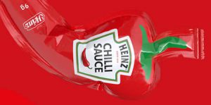
Creative sauce bottles “dressed” in a white apron, carefully printed to wrap around the label like real kitchenwear.
Cook at Home Packaging designed by Mousegraphics is wrapped in the timeless symbol of home cooking: the apron.
Made for a brand that offers special sauces as essential cooking ingredients rather than convenience-based add-ons.

In contrast to typical jars and cans that imply soulless consumption, Cook at Home represents a natural blend crafted for personal rituals in the kitchen.

The apron evokes the image of the grandmother stirring a pot, the parent preparing dinner, and the weekend experimenter trying something new.

Simple design takes the most recognizable icon of domestic cooking and makes it the focus of the brand by transforming packaging into storytelling.

The apron tied at the back in a bow, an elegant nod to tradition, frames the nutritional facts like a seal of excellence.
Splash of sauce stain adds a human touch, as if the bottle was pulled straight from a real kitchen.

Cook at Home is not just a sauce brand. It is a love letter to the kitchen, to the real magic of everyday meals made with care, not shortcuts.

Also check out: Chicken Drumstick Sauce Packaging