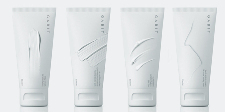
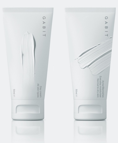
Beautiful and creative packaging features photorealistic surface textures of smears, cracks, and fine ridges placed onto the Gabit Cosmetics tubes.
Gabit Cosmetics packaging designed by Mousegraphics embraces a monochromatic white palette to create an impression of purity and calm.
The smear of a cream. A dry skin crack. A soft ripple of sunscreen. These visuals make the product feel personal, tactile, and human.
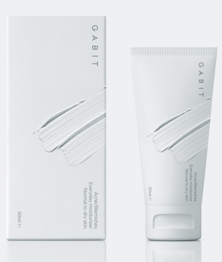
Gabit, a cosmetics company based in India wanted a concept distilled from the “-bit” in its name, referencing “the most basic unit of information.”
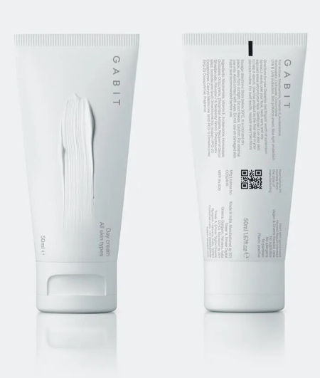
Details do not depict the product’s purpose explicitly, but rather signal a skin concern or use: blemishes, sun protection, aging.
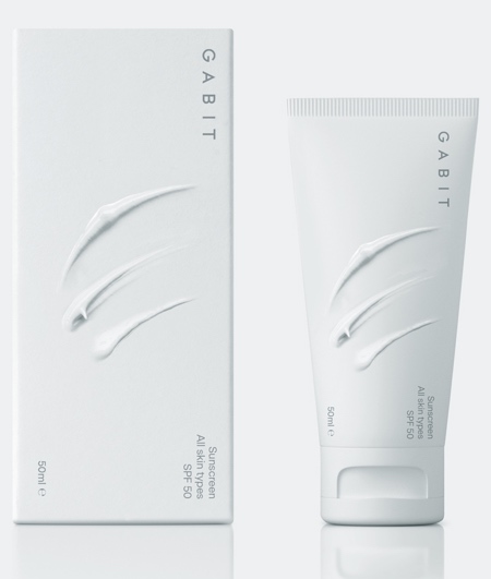
Each Gabit tube features a three-dimensional imprint on the surface: a cream smear, a cracked texture, a swipe of lotion.
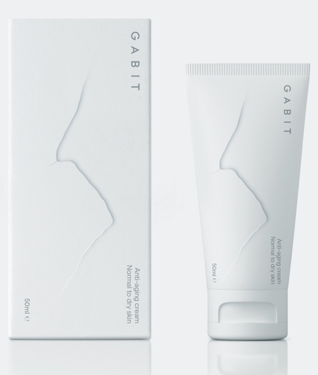
These cues are not literal illustrations or icons but material gestures, hinting at both the product’s texture and the skin concerns it addresses.
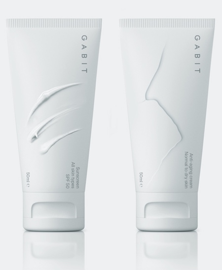
Instead of relying on typical cosmetic tropes like perfect skin photography, bold claims, or medical language, Gabit packaging design embraces imperfection.
Also check out: Creative and Innovative Packaging
