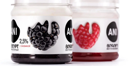
Transparent jars feature realistic fruit illustrations that melt into the layered yogurt inside and practically sell the product before the lid even comes off.
Yogurt Packaging designed by Backbone Branding to carry the legacy of the Ani brand perfectly balances heritage with modern simplicity.
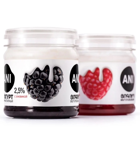
There is no overcrowding, just a clean black-and-white Ani logo, a lean typeface, and the fruit doing all the talking.
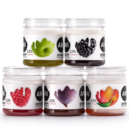
Each jar has its own fruit identity, a green apple, a glossy blackberry, rendered with hyper-realistic texture, bleeding into the minimalist white label.
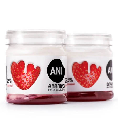
Cool and creative Ani Yogurt Packaging uses design not just to decorate, but to communicate: cleanly, cleverly, and confidently.
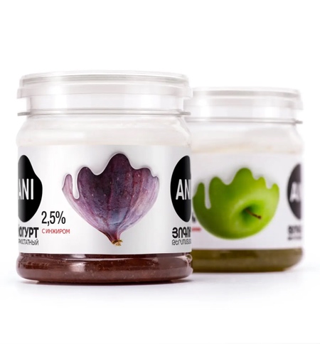
The fruit isn’t just shown, it is melting into the yogurt, visually blending the contents with the label.
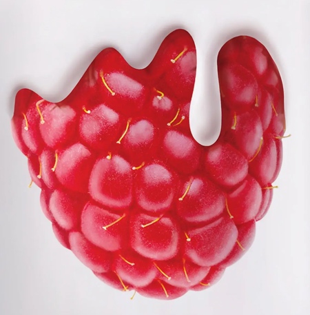
Instead of cluttering the label with health claims or cartoon cows, Ani Yogurt Packaging uses restraint, and in doing so, it says more.
Also check out: Northy Ice Cream Packaging
