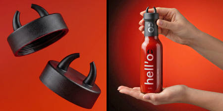
Clever packaging with scary horns on the cap developed for a Mexican-style hot sauce made from roasted red chili peppers.
Hell’o hot sauce packaging designed by Alexey Lysogorov combines the idea of “hellish heat” with irony and design.
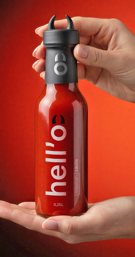
Creative bottle cap featuring horn-like protrusions directly references the brand name and reinforces recognition through form.
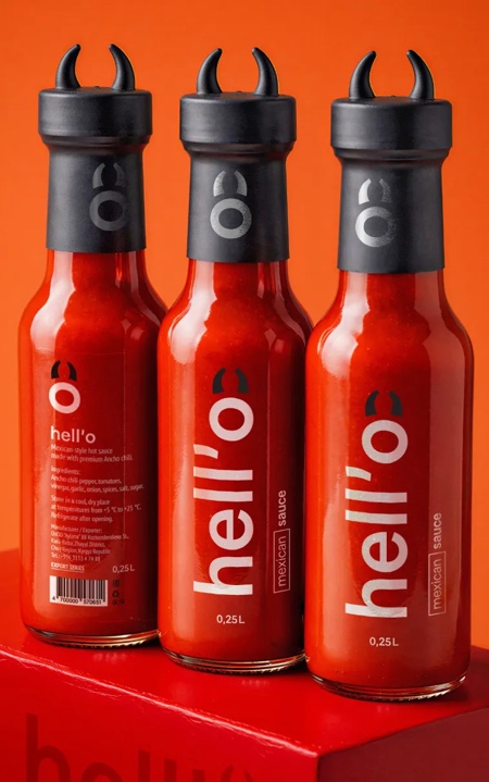
Memorable and production-efficient Hot Sauce Packaging with a character.
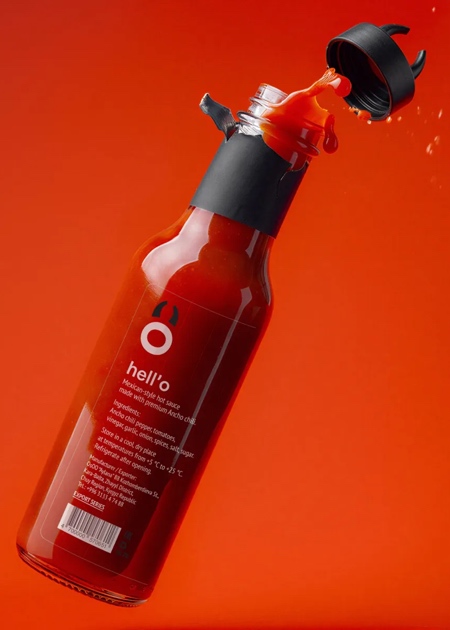
One apostrophe, one horned O, one red bottle, and the product explains itself before you have even read the label.
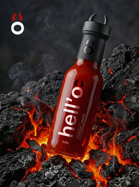
The apostrophe in Hell’o forces a pause, creates curiosity, and separates “Hell” from “O,” making heat feel playful rather than aggressive.
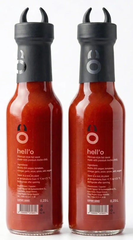
There is humor here, but it is controlled. The horns are small and the joke is subtle. Hell’o brand trusts the audience to get it without explanation.
Also check out: Chili Sauce Packaging


