Did you know that many famous companies have objects and symbols hidden inside their logos? This post showcases cool logo designs that cleverly use negative space to convey subliminal messages.
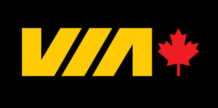
Via Rail Logo
Canadian rail service features train tracks in the middle of their logo.
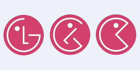
LG Logo
Some people believe that Pac-Man is hidden inside the LG logo :)
Hanuet Wine Logo
Elegant logo by Euan MacKenzie features two wine glasses.
Families Logo
This timeless logo was designed by Herb Lubalin back in 1980.
Goodwill Logo
Goodwill’s logo is a stylized letter “g” that doubles as a smiling face.
Portrait Photos Logo
Creative logo for portrait photography studio by Atakan Seçkin.

Bison Logo
Clever logo designed for a rock band from Vancouver, Canada.
Summit Logo
Cool symmetrical logo designed for a rock climbing clothing brand.
City Direct Logo
Brilliant logo designed by Mike Erickson for an airline company.
Formula 1 Logo
Negative space in the middle creates the shape of the number one.
Carrefour Logo
The name of the company means crossroads in French. The logo features the letter “C” between two arrows that point in different directions.
Toblerone Logo
The image of a bear is hidden in the Matterhorn mountain symbolizing the town where the first Toblerone chocolate bar was created.
Big Ten Logo
United States’ oldest Division I college athletic conference expended to 11 teams and their logo was modified to reflect the change.
NBC Logo
One of the world’s most popular logos features a peacock looking to the right to show that the company is looking forward, not back.
Eight Logo
Creative logo designed from different parts of the number eight.
Modern Nerd Logo
Boudewijn Vermolen incorporated the word “nerd” inside “modern”.
ED Logo
Cool logo designed by Gianni Bortolotti for Italian electric company.
Giraffe Logo
Memorable logo designed by Lemika for Giraffe design studio.
Amazon Logo
Logo features an arrow shaped smile that represents customer satisfaction and reflects Amazon’s goal to sell every product from A to Z.
Sun Microsystems Logo
Popular logo designed by Vaughan Pratt features four interleaved copies of the word sun and can be read from any direction.
E2 Logo
Creative logo designed by Judd Madden for E2 Consulting.
Mammoth Mountain Logo
Brilliant logo designed for a ski resort represents a mammoth, a mountain, and even a ski trail.
Raven Logo
Creative logo designed for a Dutch financial advice company.
FedEx Logo
Negative space between the letters “E” and “X” creates an arrow.
Hundreds of talented designers from over 100 countries are waiting to create your company logo design. Start a logo contest at LogoMyWay.

Bill
Never noticed the fedex arrow before…
Jun 9th, 2010
Megan
The Pac-Man one is genius :) LOL
Jun 9th, 2010
aditia
yeah the Pacman is the creative one, first time I know this
Jun 9th, 2010
Todd Wallace
I’ve always loved the Families logo.
Jun 9th, 2010
Régis
The Carrefour logo also seens like a alien when you rotate it 90° to the right. In the red and blue logo (the most used here in Brazil)is easier to see, but it’s there and has a funny hat! ;)
Jun 10th, 2010
GustaveCo
I think the ED logo is really smart.
Bison is amazing also.
Jun 10th, 2010
Tori
I think the LG to PacMan is a bit of a stretch. But, overall, nice collection!
Jun 10th, 2010
Ron
Do not get the NBC one at all :S
Jun 10th, 2010
Agarigi
where is the bear in the toblerone logo? i cannot see it.. is it only me or..
Jun 10th, 2010
lol
i really like the pac man one
Jun 10th, 2010
Jani
Awesome. I did not know that “Arrow” thing on the “Fedex” logo.
Thanks for sharing :)
Jun 10th, 2010
Pri
Superb stuff.. Imagine the creativity involved.. Kudoss
Jun 10th, 2010
Art of Concept
Really great collection! uch creativity! I must say I’m one of those that never noticed the arrow in the Fedex logo!
Jun 10th, 2010
Lachie
They missed this! Its canterbury clothing company from new zealand. Kiwis are hidden in the c’s. Through this logo the kiwi appears on many international rugby jerseys!
Jun 10th, 2010
Cliff
Definitely the Italian ED logo.
Possibly the simplest and yet most impactful.
Thanks for posting
Jun 10th, 2010
cchana
the one for carrefour really impressed me! shown it to loads of friends and family and no one ever knew! i don’t know if that’s good or bad design! :S
Jun 10th, 2010
simon
that’s genius
Jun 10th, 2010
Toasty O's
I have never noticed the G in the goodwill logo before, I always saw the face.
Jun 10th, 2010
Ken
The Round Table Pizza logo is some flags or banners that spell FUN
Jun 10th, 2010
Kirvi Inci
Agarigi : I don’t see it either.
Wait! I found a better picture of the Bear.
If you look really close you can see a bear standing on it’s haunches.
Jun 10th, 2010
AAAAAAAAA
I don’t understand the NBC one, but ok lol.
Jun 10th, 2010
Karin L.
Quite Creative Design!!!
Jun 10th, 2010
Betty
There are brilliant and I’d never notice the FED EX arrow either but somehow, I think it registered on a subliminal level. Effective!
Jun 10th, 2010
Karen
the FedEx one its the most brilliant i think. some one pointed that out to me before, i was super suprised.
Jun 10th, 2010
Sharyn
They were brilliant! It took a while for me to see some, particularly the bear in the Toblerone and the Raven logo.
Jun 11th, 2010
Levente
Nice ones!
I also like the Orange County Choppers’ logo, you should check it
http://www.orangecountychoppers.com/
(OCC with a hidden chopper.)
Jun 11th, 2010
Ben
Wow! That’s really cool!
When I think I see some of these logos every days and never realized that, I feel so stupid !!!!
Jun 12th, 2010
Moo
Great post! Did not realize the amazon, nbc, goodwill, or toblerone special effects even though i see those logos every day. I knew about the Fedex. And I don’t think the Lg to pacman is a stretch at all. It actually looks so obvious now.
Jun 13th, 2010
sunil sahoo
wow beautiful..
Jun 13th, 2010
Raads
some pepole fail to realise that the lg logo is supposed to be a face :D
Jun 13th, 2010
Steven
isnt de D in the feDEx logo fat at the bottom?
Jun 14th, 2010
Rit
Vote for RAVEN logo :)
Jun 14th, 2010
Diego
very cool logos!
Jun 14th, 2010
passion
good!!
Jun 15th, 2010
dollydigital
Good ol’ Fed Ex logo. I bore everyone I know saying ‘can you see the arrow, can you arrow!?’
Crackin’ list!
Jun 16th, 2010
Ana
The FedEx logo also has a spoon in the word “Fed” It’s between letters E and D.
Jun 18th, 2010
Garrett
The balance of pulling off an effective logo that communicates the desired message, with a hidden image is an impressive feat. It sort of gives them a one two punch. 1) When you notice that it is an attractive logo and then 2) when you realize the length of care its creator exhibited to hide an image inside fairly uncomplicated graphics.
Jun 18th, 2010
Raads
@ Steven well ds are generally ‘fatter’ at the bottom than they are at the top :D in the english alphabet of course. the Bison one is perfect!!!!
Jun 29th, 2010
Jim
Will be interested to see how Big 10 reflects addition of Nebraska. Guess they have about a year to work on it.
Jul 1st, 2010
yellowww
I like E2. Nice stuff!
Jul 22nd, 2010
Julian
Carrefour is my favorite. Not just it’s a “C” and two arrows, it’s also a Fish! carrefour is a hypermart, modern marketplace. The fish is rellevant.
Aug 9th, 2010
Becca
NBC has a peacock because it was the first station to air in color, not because the peacock is looking forward.
And these are ballin’. :)
Sep 2nd, 2010
Joey
LG logo reminds me rather of a smiling pirate, but from what I know PacMan is a cheerful guy too. ;)
Sep 4th, 2010
G Loaf
The arrow in the fedex logo was ALL I could see as a kid
Sep 11th, 2010
ChEeSe
ive never noticed the fedex one b4
Sep 21st, 2010
Nigel
wow never noticed the pacman using it for an art project thanks!
Sep 29th, 2010
l o o j a w
Inspiring ;p
Oct 12th, 2010
Manik
All logos are just awesome. Fantastic use of negative space can be seen. Fedex and eight are my favorite logos.
Thanks for the post.
Oct 14th, 2010
Krunal
Never noticed the fedex arrow before… Good One..
and also Portrait Photos Logo is superb.
Oct 18th, 2010
Gummy
how about the 2 different cups (one tea cup, one red cup) as the O’s in the logo for Solo Cups?
Oct 22nd, 2010
Antor Paul
Haha, I didn’t see the Pac Man inside LG before!! I can’t find the Bear in Toblerone…and I found out about the FedEx arrow only a while before reading this post, I thought I was the only one who noticed it :).
Nov 19th, 2010
Joby
I believe the ‘Sun’ logo is the most brilliant. Reminds me of this book called Angels and Demons from Dan Brown. Eight and ED logo, superb as well.
Kinda funny how many logo’s are based on positive-negative space.
About the Toblerone: I think you should focus on the wizard kinda creature and erase the hat, what remains would be a smiling polar bear in my opinion.
Dec 19th, 2010
Frankie
I’ve noticed all of these before I came to this website except Modern. I didn’t know it made the word nerd. This is a cool site.
Dec 23rd, 2010
Darren
Cool, creative, awesome.
Dec 23rd, 2010
Sid
deep
Dec 27th, 2010
Alice
haha my friend was talking about the arrow in FedEx in a presentation she did and I thought it was cool to find it here too
Jan 26th, 2011
Trey
One of my favorites is the Northwest Airlines logo, where the smal triangle in the upper left combines with the italicized “N” to form a W, but ALSO points to the … wait for it … northwest.
Feb 3rd, 2011
Kat
I would have never noticed these before! AMAZING!! :)
Feb 25th, 2011
Mary
WoW! I never looked at it that way. These logos indeed contain all these elements. Interesting discovery.
Mar 12th, 2011
Mac Adoug
You missed the tusks in the Mammoth logo.
Apr 24th, 2011
Coolsacs
Is it only me or everyone noticed a Face in LG’s first logo ..btw that pacman thing was awesome …the whole list is awesome..
May 28th, 2011
Jason
Pac Man!!! Lololololol :)
In FedEx newer seen this arrow 0_o
thx, great post!!!
Jun 3rd, 2011
Darryl Ware
FedEx always a favorite…did not see another favorite a very good logo,,,xpedx
Jun 11th, 2011
Pete
Logos are the hardest things to design. Love em all.
One of my all time favorites is the old Northwest Airlines Logo. Very Clever…
Jul 27th, 2011
Mike
The company LG used to be called “Life’s Good” so I think the stylised face was a way to remember that.
Otherwise great collection
Jul 30th, 2011
Jo
For geeky people in the UK check out the Highways Agency and the Chartered Institute of Taxation. I promise you : )
Aug 5th, 2011
Tukba
I never realised that the negative space in the F1 logo was a 1. I thought it was the red stripes that was the one.
They are all fantastic and all provide a smile in the mind :-)
Oct 4th, 2011
jimluschen
the Kahlua label is a subliminal picture of a man’s left profile (the Frito Bandito?). He has significant 5-o’clock shadow.
Nov 16th, 2011
Purple elephant
Summit Logo
It is for a ski outfit store/brand don’t know which one :/ you can tell by the headgear :)
Dec 1st, 2011
Lulu
We just talked about the care four one in class today!!!
Jan 12th, 2012
Nini
cool designs
Jan 21st, 2012
Sammy
Awesome Ive never noticed that stuff!!
Jan 24th, 2012
Mike
Ever notice the apple logo has a subliminal massage i only noticed it last week the bite on thr apple matches with the backround and looks like a old telephonr
Jan 29th, 2012
Kristie
Designing a log right now and this post is so helpful- incorporating a hidden symbol/picture for sure now!
Mar 3rd, 2012
awesome
i got a 110 on my project because of all the hidden meanings
Mar 16th, 2012
pandi
i Expected the tusks in the Mammoth logo. But Missed. Otherwise good:-)
Mar 22nd, 2012
connie kim
there is more! the spoon half shaped circle
Mar 23rd, 2012
georgia stanford
love the pac-man one and the fed-ex arrow!!!! haha :)
Apr 26th, 2012
Sneha
The ‘eight’ logo and the ‘ED’ logo are brilliant! :)
May 3rd, 2012
Lexi
I think fedex is very clever btw if u write out my name like the way fedex is there is also an arrow in my name
Jun 30th, 2012
CHRISTOPHER
These are really brilliant.The one I like most is the ‘RAVEN’.
Jul 19th, 2012
fedex fail
fedex logo is a complete fail.
apparently “symbolising speed and precision” – what a load of crap!
If you believe in the power of the subliminal and subconcious with hidden negative space then I’d be more concerned about overlooking the hidden spoon in the ‘e’ of (ironically) Fed. Someone’s been spoonfeeding someone bullsh*t somewhere…
Aug 6th, 2012
Karen
ugh. are you all in kindergarten? what do they teach in design school these days? Hidden symbols …… it is negative space.
Aug 28th, 2012
Stephen
For those having trouble with the bear: http://i.imgur.com/b1Npg.jpg
Aug 28th, 2012
Julissa
Brilliant logos, italian electric logo is genius lol i love all the sweet creative minds out there :)
Sep 5th, 2012
Summer
The FedEx one also between the e and the d the bottom of the e makes a spoon
Oct 27th, 2012
Haley Bryan
My dad used to say to look at FedEX for a pic. And I thought it was the DE which looked to me like a big rig but now that I look I see the arrow.Lol I thought I was stupid cause everybody i knew saw the arrow but me.
Nov 24th, 2012
DDS
Wow! I’ve never noticed the Toblerone bear before!
Dec 24th, 2012
ter
The peacock in NBC really surprised me
Jun 15th, 2013
Silver Surfer
Very nice !!
LG used to be “Lucky Goldstar”.
The arrow in FedEx means “Moving things forward”.
I think I finally saw the bear in the Toblerone logo, I think it’s standing on his rear paws.
NBC peacock, I see thing logo since I was a child and never seen it.
Jul 16th, 2013
rick
off all these, no mention of the apple logo.
Dec 7th, 2013
Robert
There is a teaspoon In the fedex between e and d
Dec 24th, 2013
MrM
I always thought the ‘ski tracks’ in the Mammoth logo were actually TUSKS
Jan 20th, 2014
jimmy
Still dont notice the bear in tobelrone
Apr 14th, 2014
Matthew
For all the people who can’t see the bear in the toblerone. He’s on the far left. He takes up all of the far left.
Dec 2nd, 2014
Mia
Now I can’t unsee the arrow in FedEx lol
Dec 28th, 2014
Sascha
The Amazon was the coolest for me and FedEx
Nov 24th, 2015
marry
My dad showed me the FEDEX one I thought it was guinuis that there’s an arrown in between the e and the x
Nov 25th, 2015
Suzette
Also in the FEDEX if you look at the first e and d there is a rear axle. My brother works for them and showed me that one.
Jan 6th, 2016
jaz
i see a squirrel more then a bear in the toblerone logo is it just me?…
Jan 19th, 2016
Epic Man
The FedEX one was giunies or how ever how you spell that
May 25th, 2016
idk
i dont get the families one
Aug 3rd, 2016
John
In the nbc logo all the colors stand for what your missing in a tv,rca is a tv company and made nbc also theres a peacock in between the colors.
Nov 23rd, 2016
Radley
FedEx has a arrow in the middle of the e and x
The end(;
Apr 6th, 2017
Richa S
Most ppl out here seem to be fixated with fedex and lg logos. Somehow, I knew about these two all along. It is the bison and eight that i find most creative of all. Notice the pain the logo creator must have taken to create these designs.
Jul 21st, 2017
Xulfi
Ants in my eyes Johnson
Nov 2nd, 2017